It might be tempting to single out accessibility in design into a separate category, but we wouldn’t suggest it. Accessibility is closely connected with usability, which is a universal standard, not a special design approach. We’d rather treat accessibility as web design for everyone, instead of an advanced option for people with disabilities. Aren’t we all unique and have specific needs? Won’t all of our abilities age as we get older and require constant change? If the answers are “yes,” it’s high time we solidify accessibility design standards to celebrate diversity.
Main facts on accessibility in design
Accessibility web development covers a broad spectrum of recommendations and standards within user experience design services, teaching us how to include everyone when using the internet. Those with disabilities do, in fact, need web content to be more accessible. In the era of online content being king, there are four primary types of disabilities that shouldn’t be ignored:
- Blindness, including weak vision and color blindness
- Cognitive limitations including the environmental-dependent perception limits
- Hearing loss and deafness
- Motor disabilities, including temporary ones
Accessibility design focuses on more than the development of web products for people with physical or cognitive limitations, as mentioned above. In general, accessibility design standards exist to make online content more friendly and accessible for all users. The responsibility of the design team is to apply accessibility design towards text, images, sounds, interactive elements, code, markup, etc., making them browser and device compatible.
Accessibility design is demanded on various levels, including governmental
Applying accessibility in design is a continuous process, only gaining steam since the 2000s and especially after 2010. Compliance with accessibility requirements is inevitable, considering the attention given to state and governmental levels and the part they play. However, despite similar demands, approaches may differ.
For instance, the EU and the US practice disability, anti-discrimination, and industry-specific laws. The US Access Board established Section 508 standards, which apply to electronic and information technology procured by federal agencies. The European Accessibility Act (EAA) is a bit different and demands digital accessibility throughout the value chain of manufacturers, authorized representatives, importers, and distributors of digital products and services.
Teams working on web accessibility have an indispensable guide, called Web Content Accessibility Guidelines (WCAG). These guidelines were launched by the World Wide Web Consortium (W3C)’s and orchestrate all initiatives in the accessibility design sphere.
To simplify, WCAG are organized by various success criteria distributed across three conformance levels:
- A — This is fundamental accessibility of web products. For example, perceivable criteria on this level may suggest providing captions for video and audio and advise against playing the content automatically.
- AA — If you comply with AA standards, it means you’ve eliminated most barriers people with disabilities face when using the web. An example of this can be the requirement for websites and applications to support both landscape and portrait orientations.
- AAA — Although level AAA is the accessibility target that should be hit, it’s a tall order. It may require a lot of effort and finances to upgrade a website to the ultimate AAA level. Take navigation standards as an example; users should be informed where they are with each click, all links should be clearly identified, while the content should be neatly organized with headings for an easier read.

Source: WCAG – Quick Facts and Guide
The current 2.1 version of WCAG came on board in July 2018 with seventeen new success criteria. These added criteria fill in the WCAG 2.0 gaps of mobile convenience, low-vision issues, and cognitive disorders.

Source: WCAG 2.1 – Supporting Accessibility Worldwide
Accessibility is a legal, moral, and business imperative
We touched on the legal imperatives that guide businesses towards wider adoption of accessibility design, but there’s one more thing to remember in legal terms. Legal regulations not only impose accessibility standards but also protect people with disabilities. Have you heard of Nike being sued for inaccessibility? In 2017 they were sued for lack of website accessibility for low-vision users. Their websites dіdn’t work with screen readers, they lacked alt-text, and used empty links. So the advice is not to wait for the lawsuits to destroy your business or reputation.
Moral aspects and values help companies to stand out, showing that indifference is not an attractive virtue in modern society. Globally, around one billion people experience some form of disability. Accessibility means paying attention to 15% of the world’s population with their specific, but quite natural needs and desires. Likewise, each person with a disability sees, hears, and experiences life differently. So are we really that different? With this in mind, accessibility UX should be a moral standard that welcomes diversity but provides equal opportunities to the global population.
From a business point of view, not offering accessible websites potentially means losing millions of clients. According to the American Institutes for Research, people with disabilities in the US are a hidden market with a total income of $490 billion (all who are working-age citizens). This group should not be ignored. By making your web products accessible, you will reap the many benefits these users can bring you. Besides, accessible websites are highly appreciated by Google, which means accessibility web development will bring better search results and a bigger audience. Accessible websites are also perceived as SEO friendly and with greater usability, allowing business owners to expect a higher search engine ranking.
What is persona spectrum and how it is used in accessibility web development
The imperatives of accessibility in design is best manifest in the persona spectrum approach. At Intellias, we imagine our potential users as people who fall into one of three categories:
- Those with a permanent disability
- People with a temporary disability
- Users with situational disabilities

A persona spectrum is not a fake person. It’s an articulation of a specific human motivation and the ways it’s shared across multiple groups. It shows how that motivation can change depending on the context.
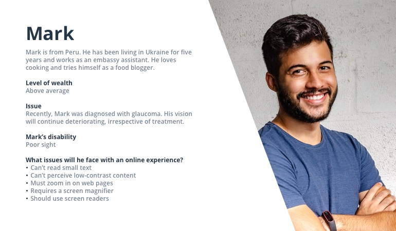
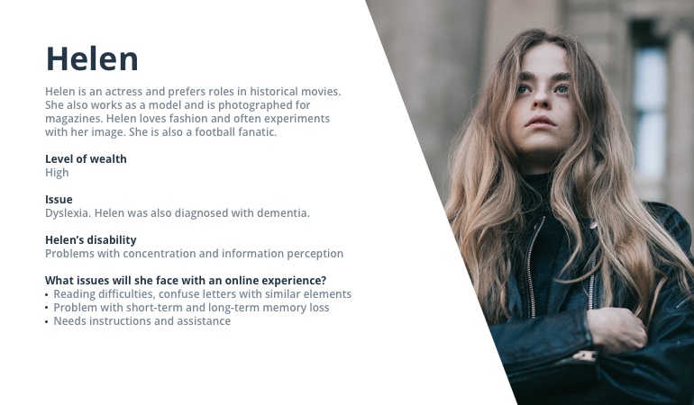
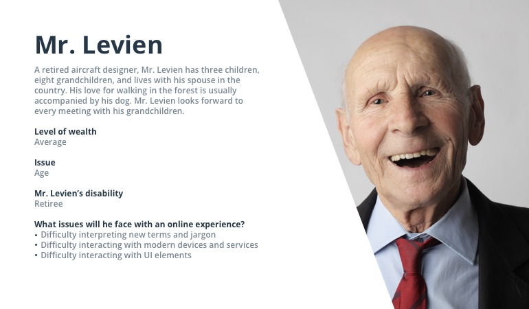
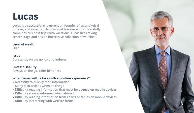
To meet the needs of all three segments, the Intellias design team treats personas of all types as real people. So, let’s welcome Mark, Helen, Mr. Levien, Lucas, Mary, and Wendy.
Persona #1
Persona #2
Persona #3
Persona #4
Persona #5
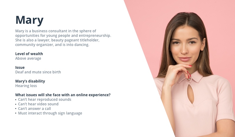
Persona #6
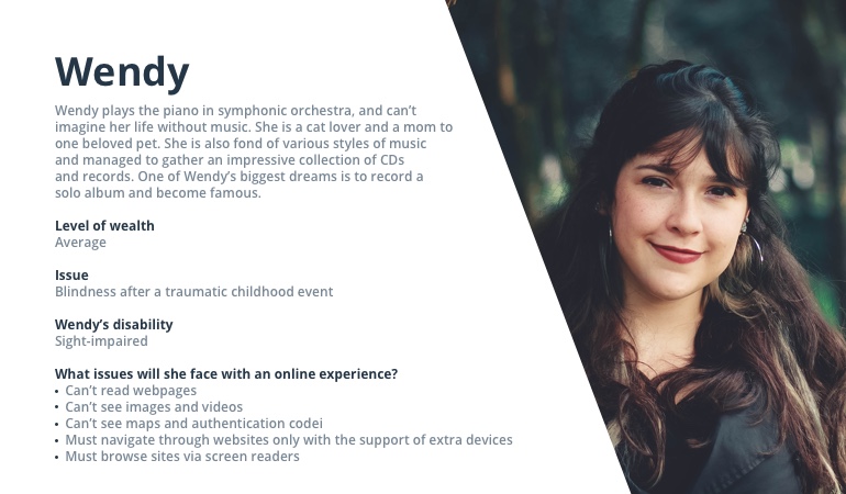
How we solve the problems of our personas
Having personas helps the design team to apply a personalized approach to their work. Still, making web products accessible shouldn’t be the prerogative of only the design office. To increase the scale of accessible web products, product and project managers, as well as sales managers, should be ready to communicate the importance of accessibility in design before the project starts. Only by aligned efforts, can project teams combat the myth that making a website accessible is something difficult and expensive. What is complicated and costly, is later having to fix and redesign web products to meet accessibility design standards, so it’s better to cover them from day one.
Wrong approaches to accessibility in design
From a designers’ point of view, there are specific do’s and don’ts in accessibility web development. Let’s look at them here.
The “don’ts”:
- Don’t ignore problems. Accessibility issues might be both permanent and temporary. Think of temporary or situational disability. Being blindish for a few hours after medical procedures or allergic reactions when your eyes or body are too sensitive — everyone can be a victim of such circumstances. It means that situations when your loyal users need digital assistance are quite common. It’s better to be proactive and understand how not to lose your client’s loyalty by lacking web accessibility for your product or service.
- Don’t envision those who need help as being far away. Due to various personal reasons, some who struggle will never reveal their peculiarities. Moreover, in many countries, accessibility needs are simply neglected. Look at the color-blindness stats alone. Color vision deficiency, or CVD, affects approximately 1 in 12 men (8%) and 1 in 200 women worldwide. Globally, it comprises around 300 million people with color blindness, almost the entire population of the USA.
- Don’t ignore testing your products in many ways. It’s easy to acknowledge the many needs of potential user personas when the product hasn’t gone live. Neglecting to test web solutions for accessibility, leads to greater problems down the road.
- Lack of rapport between customers and the project team often leads to misunderstanding in accessibility design. As designers, the project management should also appreciate the importance of covering accessibility in design and talk it over with customers.
How can accessibility web development help?
Always bear in mind the design principles that work best for individual needs. We want to share several of them with you.
- Web products should be built considering unique, human differences. It’s better to think beyond people with disabilities. Taking care of users in various circumstances that may affect the way they make decisions and interact with web products will help you reach the most massive category of customers.
- Defining goals and maintaining accessibility design standards from the initial stages of the project will serve the purpose of making web products more approachable. This can be achieved by increasing the clarity of letters and text blocks using a minimum contrast ratio between the text and background at 4.5:1. 3:1 is also acceptable for large or bold fonts.
- Provide guidelines across all web products and devices. Websites should offer properly structured and labeled elements, share simpler alternatives to the main navigation, enable keyboard shortcuts, etc.
- Usability equals accessibility, which manifests in optimized code, simplified layouts, understandable terms, and language.
- Be attentive to the interactions you are using to fill your website. They should be clear and supportive. While users with average abilities can easily choose this or that way, users with disabilities often count on a single type of interaction, so make sure it’s one that works.
- Users should be able to perceive and understand all the design elements. To achieve this accessibility design standard, the design team must pay attention to video transcription, image captioning, image alt attributes, title tags and header tags, avoid using URLs as link text, don’t overuse text links on one page, etc.
Conclusion
From each and every expert in the design team, up to top managers, businesses should publicly promote their commitment to accessibility on every level. Following the accessibility design standards, we’ve discussed in this article will help you make online experiences both appealing and usable, especially for individuals with disabilities. Still, our key message is to ensure accessibility in design is not something optional or exceptional. It is now the golden standard for designing web experiences.
To continue discussing best standards in UI/UX design, contact our Intellias experts.

